- DATE:
- AUTHOR:
- The Xyte team
Coming Soon: A Cleaner, Smarter UI Experience in the Customer Portal
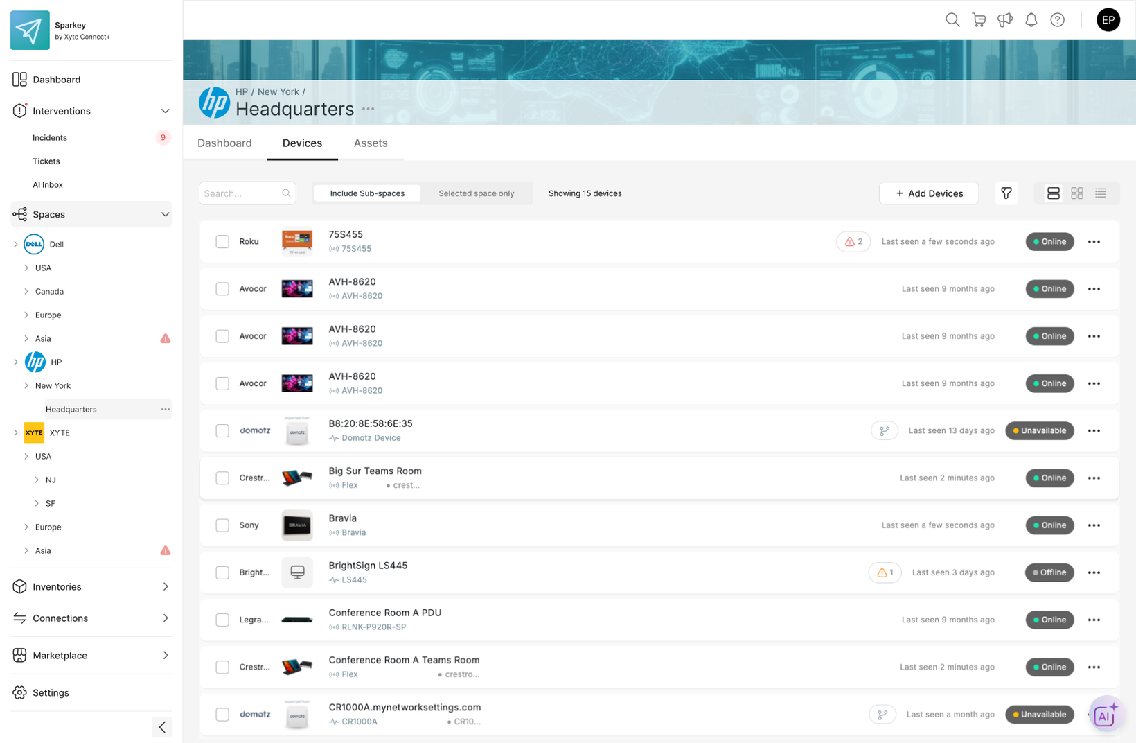
We’re excited to share that a refreshed interface is on its way for the Xyte Customer Portal, applicable to both private cloud and Connect+ users! This update is designed to help your customers see more, navigate faster, and manage their device estate(s) more efficiently.
Designed with productivity in mind
Improved Clarity: A cleaner interface makes it easier to understand the scope of their data at a glance.
Ease of Navigation: Simplified top and side navigation help your customers find what they need faster, saving valuable time for the most common use cases.
Better Use of Space: A smaller header and smarter layout maximizes browser real estate, allowing your customers to see more of their device estate and key information without extra clicks.
What’s changing:
Space tree relocation: The space tree that was previously part of the Organization Overview is now conveniently located in the side navigation.
Streamlined side menu items (with new names):
Interventions covers incidents and ticket management
Inventories covers devices, assets, files, and contracts
Connections covers cloud-to-cloud connectors, Edge connections, and integrations
Marketplace covers everything related to ecommerce (storefront, subscription management, invoices, etc.)
Thinner header: The header is now more compact, freeing up space to view more of the device estate in each screen.
Simplified top navigation links: Icons on the top right of the browser have been streamlined and condensed to search, shopping cart, notifications, and info
What’s next
This update is just the start. Stay tuned for even more improvements, including a powerful dashboard with analytics, insights, and more – all designed to help your customers make smarter, data-driven decisions for their devices.
Please contact support@xyte.io with any questions.